Amazon Cloud Drive - Solving the UX for photo browsing
At Cloud Drive, I led UX design for Android. During my time there we shipped four releases of the product. This team helped me cut my teeth on production UX/UI. and one of my favorite parts of working on the product was redesigning the browsing interaction for photo galleries.
Design Lead, UX/UI Design, Design to Engineering Hand-off
2013-2014
The Problem with Large Photo Galleries
In 2014 when we released the v3 feature update for Amazon Cloud Drive, the status-quo for photo galleries was a view with endless scroll. Apple was releasing iOS 7 at the time, and their key contribution to the Photos App was ‘Collections.’ The video below shows The iOS model of ‘Collections’. This new feature in iOS provided a good model for photo organization, but the navigation required a lot of context switching, and broke apart the photo browsing experience.
From here we asked ourselves:
How might we leverage a person’s natural mental models for organization, and keep them inside the photo gallery context?
Wireframes for the new navigation pattern
We explored a number of different timeline patterns. The 4 shown below were the most popular concepts during our UX design process. In the end, showing the photo-count seemed like irrelevant information. Between the Accordion Timeline, and the Vertical Stack Timeline, we decided to A/B test against our separate Mobile Clients. Android would implement the Accordion pattern, and iOS implemented the Vertical Stack.
Adoption & Discovery was good for both mobile clients (with both patterns), but we eventually pursued the Accordion variant because it scaled better to photo galleries with large date ranges
No Timeline Navigation
Accordion Based Timeline Navigation
Timeline With Photo Count
Timeline Vertical Stack
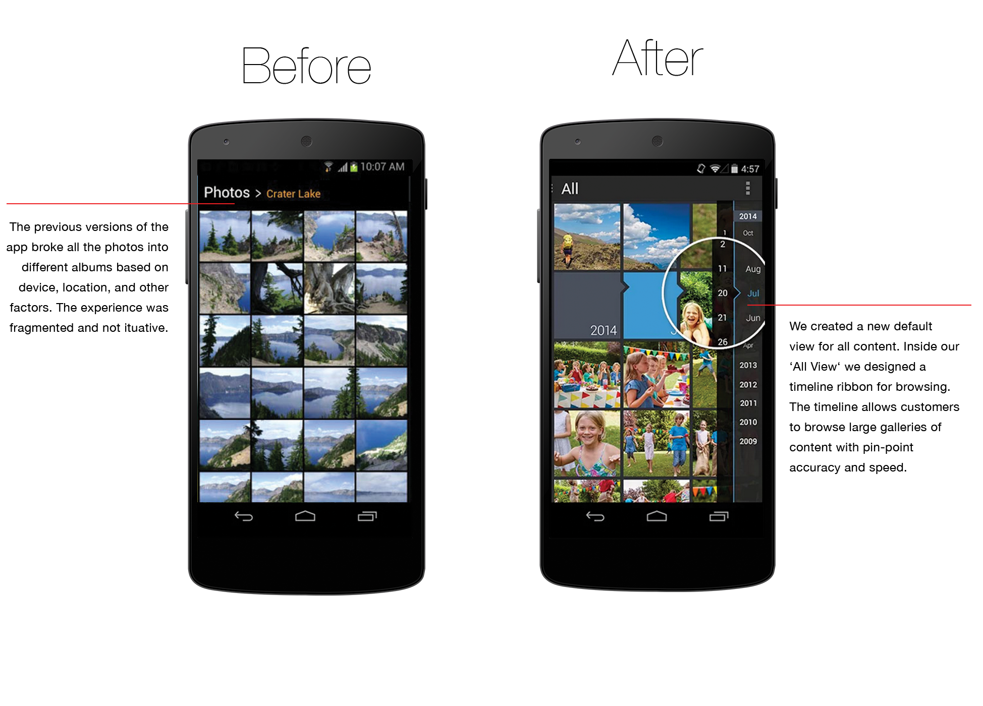
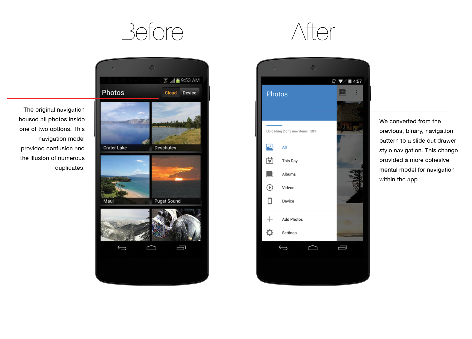
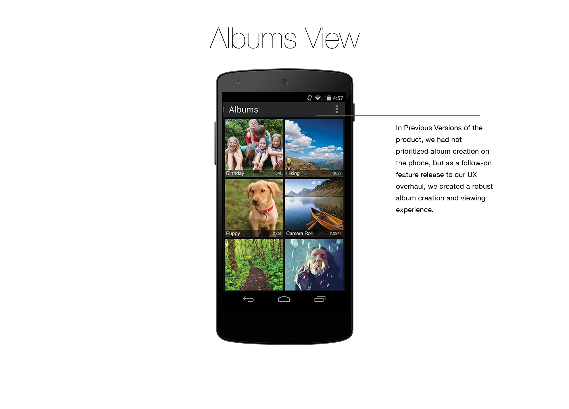
Production User Interfaces
The Android team for Cloud Drive was 2-3 developers with me as the lead designer. We released one major overhaul of the Cloud Drive UX, followed by a series of smaller feature releases. Below you can see the before & after shots of the Product.